To fix the mobile menu in WordPress, check your theme settings and update your plugins. Use custom CSS if necessary.
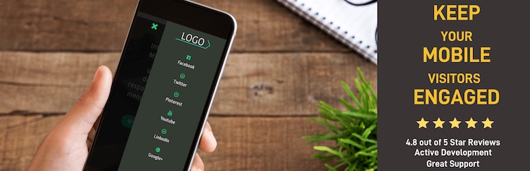
Having a functional mobile menu is crucial for user experience and SEO. Many WordPress themes offer built-in options to customize the mobile menu. Sometimes, plugins can conflict with the menu, causing issues. Updating or disabling conflicting plugins often resolves this.
Custom CSS can be added through the theme customizer to tweak the mobile menu further. Ensuring your mobile menu works seamlessly enhances navigation and keeps visitors engaged. Keeping your theme and plugins updated is a key practice for maintaining a responsive site.
Always test changes across different devices to ensure compatibility. This proactive approach helps maintain a smooth, user-friendly mobile experience.
Common Mobile Menu Issues
Fixing a mobile menu in WordPress can be tricky. Common issues can cause your site to look unprofessional and frustrate users. Here are some of the most frequent mobile menu problems you might face.
Unresponsive Menu
An unresponsive menu means users can’t navigate your site. This problem often occurs due to JavaScript errors or conflicts with other plugins.
To fix this, check your browser console for errors. Deactivate all plugins and activate them one by one to find the conflicting ones.
Another solution is to update your theme and plugins. Using the latest versions can often resolve compatibility issues. If that doesn’t work, you might need to add custom code.
/ Example CSS to fix unresponsive menu /
@media (max-width: 767px) {
  .menu-class {
    display: block;
    cursor: pointer;
  }
}
Design Breaks
Design breaks can make your site look messy on mobile devices. This issue usually happens due to improper CSS or layout settings. To solve this, use responsive design techniques. Make sure your CSS includes media queries.
| Issue | Solution |
|---|---|
| Menu items overflow | Adjust padding and margin |
| Text too small | Increase font size |
Always test your site on various mobile devices. This ensures the design looks good everywhere.
If your theme’s CSS is complex, consider using a child theme. This way, you can make changes without affecting the original theme.
- Use media queries to handle different screen sizes.
- Optimize images for faster loading.
- Check for broken elements and fix them.

Credit: codeastrology.com
Initial Troubleshooting
Struggling with your mobile menu in WordPress? Start with initial troubleshooting steps. Simple checks can often resolve most issues. Focus on clearing cache and checking plugins.
Clear Cache
Clearing the cache can solve many WordPress problems. Old cached files might cause your mobile menu to display incorrectly.
- Go to your WordPress dashboard.
- Navigate to the Settings section.
- Select WP Super Cache or any other caching plugin you use.
- Click on the Delete Cache button.
For browser cache, press Ctrl + F5 or clear it through browser settings.
Check Plugins
Plugins can sometimes conflict with your mobile menu. Check your plugins to identify any issues.
- Deactivate all your plugins.
- Reactivate them one by one to find the problematic plugin.
Once you find the conflicting plugin, look for an update or a replacement.
Updating WordPress
Updating WordPress can fix many issues, including problems with your mobile menu. Keeping WordPress updated ensures that your website runs smoothly. It also helps protect against security vulnerabilities.
Core Updates
Core updates are the most important updates for WordPress. They include security patches and performance improvements.
To update your WordPress core:
- Go to your WordPress dashboard.
- Click on Dashboard > Updates.
- If an update is available, click Update Now.
Ensure you back up your website before updating. This prevents data loss in case something goes wrong.
Theme Updates
Outdated themes can also cause mobile menu issues. Updating your theme can resolve compatibility problems.
To update your WordPress theme:
- Go to your WordPress dashboard.
- Click on Appearance > Themes.
- Hover over the active theme and click Update Now if an update is available.
Some themes require manual updates. Check the theme’s documentation for instructions.
Regular updates keep your website performing at its best. They also ensure compatibility with plugins and other features.

Credit: codeastrology.com
Inspecting Css And Javascript
Fixing the mobile menu in WordPress often requires inspecting CSS and JavaScript. These two components can cause the menu to break or function improperly. Understanding how to inspect and modify them can resolve most issues.
Common Css Errors
Many mobile menu issues arise from CSS errors. Inspect your style.css file for common mistakes.
- Check for missing or extra
braces. - Ensure
media queriesare correctly formatted. - Look for incorrect
selectorsorproperties.
Use the browser’s Developer Tools to inspect the CSS. Right-click on the mobile menu and select Inspect. This will show the applied styles. Make sure all required styles are present.
Sometimes, custom themes or plugins override the menu’s CSS. Check for any conflicting CSS rules.
Javascript Conflicts
JavaScript can also cause mobile menu issues. Conflicts between different scripts often lead to a broken menu.
- Open the browser’s Console tab in Developer Tools.
- Look for any JavaScript errors.
- Identify which script is causing the conflict.
Disable other plugins one by one to isolate the issue. Once identified, you can either fix the conflicting script or contact the plugin/theme developer for support.
Ensure all JavaScript files are correctly enqueued in your functions.php file. Use the correct wp_enqueue_script function to avoid dependency issues.
Here’s a simple example of how to enqueue a script correctly:
function my_custom_scripts() {
    wp_enqueue_script('my-script', get_template_directory_uri() . '/js/my-script.js', array('jquery'), '1.0', true);
}
add_action('wp_enqueue_scripts', 'my_custom_scripts');
This method ensures your JavaScript loads in the correct order.
Responsive Design Settings
Ensuring your WordPress mobile menu works well involves Responsive Design Settings. These settings make your site look good on all devices. Two important parts of responsive design are Media Queries and the Viewport Meta Tag.
Media Queries
Media queries help your site adapt to different screen sizes. They let you apply CSS rules only when certain conditions are met. For instance, you can change styles for screens smaller than 600px. Here’s a basic example:
@media only screen and (max-width: 600px) {
    .menu {
        display: block;
    }
}
This code makes the menu display as a block on small screens. Use media queries to adjust your menu’s layout and ensure it’s user-friendly on all devices.
Viewport Meta Tag
The Viewport Meta Tag is crucial for responsive design. It tells browsers how to adjust the page’s dimensions and scaling. Add this tag in the section of your HTML:
This tag sets the viewport width to the device’s width. It also sets the initial zoom level to 1. This ensures your site looks good and functions well on mobile devices.
Combine media queries and the viewport meta tag for a responsive mobile menu. These tools help create a seamless user experience across all devices.
Plugin Solutions
Fixing the mobile menu in WordPress can be simple with the right plugins. Plugins offer tailored solutions to enhance the mobile user experience. Below are some plugin solutions you can try.
Menu Plugins
Menu plugins help in creating responsive menus that work well on mobile devices. These plugins often come with customizable settings and are easy to use.
- WP Mobile Menu: A highly customizable plugin that ensures mobile-friendly menus. It offers multiple menu levels, icons, and animations.
- Responsive Menu: This plugin provides a touch-friendly experience. It includes options for font, background colors, and menu positioning.
- Max Mega Menu: Perfect for creating complex menus. It supports mobile responsiveness and customization options.
Mobile-specific Plugins
Mobile-specific plugins focus on optimizing the entire mobile experience, including menus. They often come with additional features to enhance your site’s mobile usability.
- Jetpack: Includes a mobile theme that improves site navigation on mobile devices. It ensures a smooth and responsive menu.
- WPtouch: Converts your site into a mobile-friendly version. It offers a customizable menu that adapts to different screen sizes.
- Touchy: A premium plugin designed for mobile menus. It provides easy navigation, branding options, and quick access to important links.
Using these plugins can significantly improve your site’s mobile menu. Choose the one that best fits your needs.
Custom Code Fixes
Sometimes, plugins or themes can’t solve your mobile menu issues. You may need to use custom code. This section explores solutions using Custom CSS and Custom JavaScript.
Custom Css
Custom CSS can solve many mobile menu problems. Use it to adjust menu styles or fix layout issues.
- Open your WordPress dashboard.
- Navigate to Appearance > Customize.
- Select Additional CSS.
- Add the following code:
/ Fix mobile menu alignment /
.mobile-menu {
  text-align: center;
  background-color: #333;
}

/ Adjust mobile menu font size /
.mobile-menu a {
  font-size: 18px;
  color: #fff;
}

/ Ensure menu visibility /
.mobile-menu {
  display: block;
}
Save your changes and check your mobile menu.
Custom Javascript
Sometimes, CSS alone isn’t enough. You might need Custom JavaScript for advanced fixes.
- Go to your WordPress dashboard.
- Navigate to Appearance > Theme Editor.
- Find the functions.php file.
- Add this code to load your custom script:
function my_custom_scripts() {
  wp_enqueue_script('custom-js', get_template_directory_uri() . '/js/custom.js', array('jquery'), null, true);
}
add_action('wp_enqueue_scripts', 'my_custom_scripts');
Create a custom.js file in your theme’s js folder. Add your JavaScript code:
// Toggle mobile menu visibility
jQuery(document).ready(function($) {
  $('.menu-toggle').click(function() {
    $('.mobile-menu').slideToggle();
  });
});
Save your changes and test your mobile menu.
Testing And Validation
Fixing the mobile menu in WordPress is crucial for user experience. Once the fixes are implemented, thorough testing and validation are essential. This ensures the mobile menu functions seamlessly across all devices and browsers.
Cross-device Testing
Cross-device testing involves checking your mobile menu on various devices. This ensures it works well on smartphones, tablets, and different screen sizes.
- Test on both Android and iOS devices.
- Check various screen sizes: small, medium, and large.
- Ensure the menu is easily clickable and functional.
You can use online tools like BrowserStack or Sauce Labs. These tools help you simulate multiple devices. It saves time and ensures a comprehensive check.
Browser Developer Tools
Browser developer tools are incredibly useful for testing. Each major browser, like Chrome, Firefox, and Safari, has built-in developer tools.
- Open your website in a browser.
- Right-click on the page and select “Inspect” or press F12.
- Switch to the “Responsive Design” mode or similar options.
In this mode, you can test the mobile menu directly within the browser. Adjust screen sizes and orientations to see how the menu responds.
Check for errors in the console tab. Fix any JavaScript or CSS errors that could affect the menu.
| Tool | Purpose |
|---|---|
| BrowserStack | Online cross-device testing |
| Chrome DevTools | In-browser testing and debugging |
| Firefox Developer Tools | Testing and validation in Firefox |
Regular testing and validation ensure a smooth user experience. Keep your mobile menu functional and user-friendly.
Credit: wordpress.org
Frequently Asked Questions
Why Is The Mobile Menu Not Working In WordPress?
The mobile menu in WordPress may not work due to plugin conflicts, outdated themes, or JavaScript errors. Check theme settings and update plugins.
How Do I Edit The Mobile View Menu In WordPress?
Go to your WordPress dashboard. Navigate to Appearance > Menus. Select the mobile menu to edit. Save changes.
Why Is My WordPress Mobile View Not Working?
Your WordPress mobile view might not work due to theme issues, outdated plugins, or incorrect settings. Check responsive design settings, update plugins, and ensure your theme supports mobile devices.
How Do I Make My Mobile Menu Responsive In WordPress?
Use a mobile-responsive WordPress theme. Install a plugin like WP Mobile Menu. Customize through the WordPress Customizer. Ensure proper navigation and usability. Test on different devices.
Why Is My Mobile Menu Not Working?
Your mobile menu might not work due to theme issues, plugin conflicts, or JavaScript errors.
Conclusion
Fixing your mobile menu in WordPress doesn’t have to be daunting. Follow the outlined steps, and you’ll enhance user experience. Ensure your website is mobile-friendly to retain visitors. Regularly update themes and plugins for optimal performance. A seamless mobile menu boosts engagement and improves SEO rankings.

